Overview
Shelly devices provide a local web interface that allows you to control and configure your devices through a standard web browser on either your computer or mobile device. With it, you can turn appliances connected to your device on or off, set schedules, and configure actions to execute when certain conditions are met.
Note that you do not need an internet connection or Shelly Cloud to use the local web interface - the only requirement is that your browser must be in the same Wi-Fi network as your Shelly device.
Accessing the web interface
To access the web interface of the Shelly Wall display:
-
Connect the device to your Wi-Fi network.
-
While you’re connected to that network, go to the IP address shown on your device.
You are now in the web interface of your device.
Understanding the layout
The web interface can be divided into four main sections - the header, footer, main menu, and main content.
Header
The header consists of two components - the name of your device on the left and a few icons, which display your device’s main network and connectivity features on the right. These icons can encompass functionalities such as Wi-Fi, Bluetooth, MQTT, and more, as well as an icon that shows if there are any new firmware updates for your device. Hovering with your mouse on an icon will provide you with further information. You’ll find a legend with the meaning of each icon in the web interface guide of each device. Please note that the individual guides explain only the connectivity features available for that specific device.
Footer
At the bottom of the screen from left to right in order are the device model name, its ID, the version of the web interface, the firmware version of the device, and finally, the current time. If the time is not synced, you will recieve a notification at the top of the screen, and some schedules and actions may not work as expected. Some previous versions of the web interface do not include all of these components.
Main menu
The main menu in the desktop version of the web interface is on the left, whereas on mobile, it looks like a hamburger menu with an icon of three horizontal lines, stacked on top of each other. The menu contains different items, depending on the device, but clicking an item from it takes you to a different page. You can also use it to get back to the Home page by clicking Home.
Main content
By clicking on an item from the main menu, you’ll be able to navigate through the web interface. Everything that you see on the screen, excluding the header, footer, and main menu is considered main content.
As the user interface might change over time, some screenshots might differ slightly from what you see in the web interface of the product.
The Shelly Wall Display doesn’t have an access point like the other devices, so the only way to access its web interface is to connect it to your network. Once it’s connected, you need to find the device’s IP. Swipe left until you reach the Settings screen, or click on the gear icon at the bottom to be taken directly to the Settings menu. Click on Network, and go to the IP address you see there. Make sure that you’re connected to the same network as the Wall Display. You are now in the web interface of Shelly Wall Display.
Main Menu
Below are explanations of each setting in the main menu, including what is visualised as main content upon clicking on the different settings. A brief introduction of the icons in the header, specific to this device, is also present in the Home page explanation. Note that the header is present in all of the screens, not just the Home page.
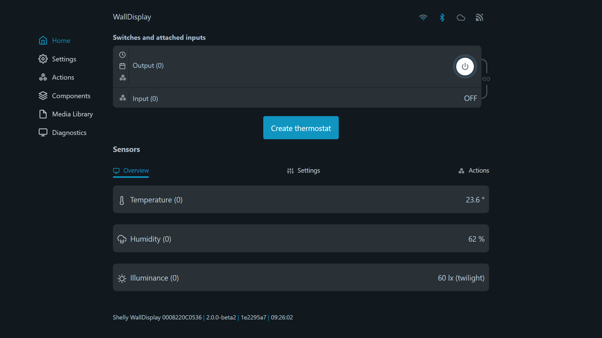
Home page
In the web interface, you will see four icons at the top of the screen, including one for Wi-Fi, Bluetooth, Cloud, and MQTT connection. Here is what the different status colors mean:Wi-Fi icon :Gray: Wi-Fi connection is disabled.White: Wi-Fi connection is enabled, but not established.Blue: The device is connected to Wi-Fi.Bluetooth icon :Gray: Connection is disabled.Blue: Connection is enabled.Cloud icon :Gray: Connection to Shelly Cloud is disabled.White: Connection to Shelly Cloud is enabled, but not established.Blue: The device is connected to Shelly Cloud.MQTT icon :Gray: MQTT is disabled.Blue: MQTT is enabled.Firmware update icon:Blue: There is a new stable version of the firmware for your device.Doesn’t appear: The device’s firmware is up to date. Websocket connection icon:Blue: Websocket connected.Grey: Websocket is not connected.
In the home page of the web interface, you will see the output and input, as well as a power button next to the output.
To create a thermostat, click on the button Create thermostat below. A message will appear, informing you that creating a thermostat requires a soft reboot, as well as temporarily making the switch component unavailable. Click OK to proceed.
In the thermostat creation menu:
-
Tick the box next to Thermostat enabled to activate the thermostat.
-
Use the slider or plus and minus buttons to adjust the target temperature. The range is between 5°C (far left) and 35°C (far right).
-
Next, adjust the temperature hysteresis between 0°C (far left) and 2°C (far right). A setting of 0°C means the thermostat will switch on and off frequently to maintain the exact target temperature. A value above 0°C creates a small range around the set temperature. For instance, if a cooling thermostat has a temperature hysteresis set to 1°C and a target temperature of 23°C, the thermostat will turn on at 24°C and off at 22°C.
-
Select the thermostat type between heating - turns on when the temperature is lower than the target, and cooling - turns on when the temperature is higher than the target.
-
Choose to invert the output by ticking the box next to that setting, or leave it as is.
-
Click Save.
To delete a thermostat, click on the button Delete thermostat. This will trigger a soft reboot.
Underneath is the Sensors menu, which has three submenus- Overview, Settings, and Actions.
Overview
In the Overview menu, you’ll see the sensors - temperature, humidity, and illuminance (light sensor) with their names on the left, and their readings on the right.
Settings
Temperature
Delta threshold
Choose a value between 0.5 °C and 5 °C from the drop-down menu, which will set the threshold for triggering a device wake-up. However, the device sends status updates as often as every 5 minutes, so if the device’s temperature changes suddenly and surpasses the threshold, the change will still be reported after 5 minutes from the last report has passed and not at the exact time it happens. You can also choose to disable this option. To save the changes, click OK.
Offset
Allows you to adjust the readings of the device to account for any heat emitted by the device itself. By setting a temperature offset, you can ensure that the readings are more accurate and reflect the actual temperature of the environment. The minimum value is -50 °C, and the maximum is 50 °C.
Humidity
Delta threshold
Set the humidity threshold in percent, which will trigger a device wake-up. You can type in a value between 1% and 20% in the text box. Relative humidity change with more than the specified value triggers the device to report sensor data. To save the changes, click Apply.
Offset
To make the humidity readings more accurate, set an offset. This is a value, which will be added to / subtracted from the readings. The minimum value is -50%, and the maximum is 50%.
Illuminance
Dark threshold
Input a value between 1 lx and 1000 lx, below which the illuminance would be considered dark.
Bright threshold
Input a value between 1 lx and 1000 lx, above which the illuminance would be considered bright.
Actions
Configure the actions for your device - create new actions, edit existing actions, or delete actions. When creating actions for your device you will need to specify the condition on which the action occurs. You can also set a duration for your actions, as well as a URL to be hit when the condition for the action is met.
Settings
Network settings
-
WiFi - Register the Shelly device to connect to up to 2 different Wi-Fi networks.
Either input or select the Wi-Fi network. Can select an open network, and also set a static IP address.
Enable Wi-Fi 1, or Wi-Fi 2, or both at the same time. If both Wi-Fi 1 and Wi-Fi 2 are enabled, and the Shelly device disconnects from one of the networks, it will connect to the other.
-
Bluetooth - Disable/enable Bluetooth by toggling the switch. The device's default Bluetooth setting is enabled.
Connectivity
Note for RPC communication: When an RPC call fails to be executed, a banner message appears - it notifies you that the device is not responding in time, and has lost connection. When the connection is restored, the request will be sent again.
-
Cloud -Connecting your Shelly to its cloud allows you to control it remotely, and receive notifications and updates about your devices. The default for this setting is for the cloud to be enabled. If you disable the device cloud support, you will lose connection to your device from outside its local network!
-
MQTT - Configure the Shelly device to execute actions via MQTT. By default, MQTT is disabled, but you can enable it by selecting the empty checkbox. Changing these settings will cause the device to reboot. There are some other settings, such as RPC status notifications over MQTT (which enables you to communicate with your device through RPC notifications) and Generic status update over MQTT (to get an overall status update), which you can enable or disable. You can also enable SSL and type in your server, username, and password, but be aware that enabling SSL will hurt the battery life and most likely shorten it by half.
-
Outbound Websocket - Specifies whether the HTTP channel creates an I/O exception when an inbound connection is closed while still in use by the servlet. By default, this setting is disabled. To enable it, click the toggle switch next to Enable. Enter your service address in the text box and from the drop-down menu under SSL Connectivity choose *, ca.pem or user_ca.pem.
Device settings
-
Device name (info) - See your device’s ID, the Wi-Fi it’s connected to, and the Wi-Fi RSSI. Additionally, you can copy the device ID via the Copy button.
-
Location and timezone - Your timezone and location will be autodetected, but you can manually change them from this setting by choosing a timezone from the drop-down menu and typing in your latitude and longitude. There is also a button Auto detect location, which will make the device automatically detect the location once again if it failed the previous time.
If the device’s time is not synced with the current time, schedules and actions may not work as expected. A message will appear to let you know if the time is not synced.
-
Authentication - If you enable authentication, you will be asked to type in a password, which you will then use to access the Web UI of the device. Once enabled, to disable it, click the toggle and enter your authentication pass once prompted.
-
Firmware - In this setting, you can see your device's ID, firmware version, build ID, and web build ID. Use the Copy button above the firmware ID or the web build ID to copy the contents to your clipboard. You can also see the available new versions, check for updates and easily update your device. There is also an option to upload your own firmware, however flashing devices with custom firmware irreversibly voids the device warranty.
-
User certificate (TLS Configuration) - Upload custom certificate authority, client certificate, and client key by dragging and dropping the file(s), or by browsing your files, which you can do by clicking the designated button. Click Upload to upload the files, and Clear to remove files you don’t want to upload.
-
Debug - This setting includes Mqtt, Websocket, and Udp debug. To enable any of these, click the toggle switch next to the specific setting. For Udp debug you will also be asked to type in a Udp address.
-
Reboot - After clicking on the Reboot button, you will be asked if you’re sure you want to reboot your device. Click OK for device reboot and Cancel if you don’t want the device to reboot.
-
Device UI - These settings enable you to customise the look of your device.
-
Screen Saver - Enable/disable the Screen Saver. If enabled, you can select one of the following components to be displayed as the top element (will have priority over the other elements) - Temperature (displays the last measured temperature), Humidity (displays the last measured humidity percentage), and Clock (displays the current time). Additionally, you can set a timeout in seconds (between 10 and 3600), which means the device’s screen will turn off after the specified amount of time.
-
Turn Screen Off - Choose when you want your device’s screen to be turned off - when idle, or only when dark, by ticking the box next to that option.
-
Screen Lock - Select None to leave the device unlocked. With this option, gestures are still available, and pages can be changed. No Settings locks only the Settings screen and allows you to use gestures and change all of the pages, except for the Settings page. Selecting No Settings triggers a soft reboot. Full means the device screen is fully locked and the pages cannot be changed. Gestures are still available
-
Disable gestures when device locked option works for every level of screen lock, except for None. The available gestures are: swipe up and down, tap with two fingers, or tap with your palm to switch the relay on and off and swipe to either side to go to another page. When the pages are locked, only the gestures for turning the relay on/off are available.
-
Actions
Configure the actions for your device - create new actions, edit existing actions, or delete actions. When creating actions for your device you will need to specify the condition on which the action occurs. You can also set a duration for your actions, as well as a URL to be hit when the condition for the action is met.
Components
Creating a component
The Components setting allows the user to create Dynamic Components, which don’t initially exist in the device. Virtual components, a type of dynamic component, are used to store or transfer data between scripts or runs and display the script’s functionality on the home page. Components can be grouped together; only the groups and the components inside of them will be displayed on the home page. Components that don’t belong to a group will not be visualized there. The number of components and groups of components per device is limited.
To create a component:
-
Click the Create new button next to User-defined components.
-
Select the type of component you’d like to create - Boolean, Number, Text, Enum, or Button. When created, each component type has Name, View, and Custom Icon URL fields, which you have to fill in. The Custom Icon URL field isn’t required, but it can be used to customise how your components look in the home page. You can rename or delete a component, as well as create actions for it, using the buttons located next to each component.
The different component types may have additional fields, specific to that type. They are explained below
The Boolean component type stores a true/false value and has two different titles that the user can enter depending on if its value is true or false, as well as two separate icons. The drop-down menu for the default value will include the different states of your device. The view options are Hidden, Toggle, and Label. The Toggle view displays a toggle button, so the component’s value changes on each hit. The Label view shows the title for the component’s value.
The Number component type stores values between -999999999999999 and 999999999999999. The default value should be a number in this range. You can also change the unit and step. The view options are Hidden, Field, Slider, Progress bar, and Label. The Field view shows an input field, the Label view displays the value, the Progress bar view visually represents progress, and the Slider view displays a slider interface for interaction.
The Text component type stores a string with up to 255 characters. The view options are Hidden, Field, Label, and Image. The Field view shows an input field, the Label view displays the title, and the Image view requires a URL value, which it uses to display an image.
The Enum component type stores a group of named constants. The view options are Hidden, Dropdown, and Label. If you select Label view, the component will display the title by default, but if an image is specified, it will take precedence and be shown instead.
The Button component type provides a simulated virtual input that allows users to interact with the user interface by registering and reporting clicks. It then sends notifications through connected channels and can be used to trigger automations, and activate webhooks. It features two view options - Button, which displays the button component in your home page, and Hidden.
If a component is set to Hidden, it won’t be displayed in the home page. Otherwise, your component groups will appear below your device’s input(s) and/or output(s) and will display the components, which are part of those groups.
Creating a group of components
To create a group:
-
Click on the + next to User-defined groups, and you’ll be taken to the group creation menu.
-
Enter the name of the group.
-
Select the desired components that you’d like to have in that group.
Editing your groups menu is done through the pencil icon next to the + and it allows you to change the order of your groups by clicking on the up and down arrows to move a group up or down.
Component actions
The Actions menu is now structured based on component type. So, you can create actions for your components and they’ll be separated into the aforementioned five categories.
Scripting
Components can be included in scripts and programmed to change values depending on a condition. To specify a component in a script, you’ll need to use its ID. Component IDs start from 200 and are limited to 299. You’ll be able to see your component’s ID in the Components menu.
Media library
Upload media from your device onto the Shelly Wall Display. Image files can be used to set a screen saver. Audio files can be used by adding a Music tile to the display. Only .mp3 files are able to be used.
Diagnostics
From this setting, you can download the debug logs. Enabling the debug log without a reason isn’t recommended, since your device will be slowed down and this setting will cause aging of the flash memory. If you do decide to enable it, you can also download the previous and current logs. Be aware that leaving this page will reset the logger and log data.
HTTP ping
Enter a URL in the designated text field to send an HTTP request to it from your device. The web interface will then let you know if the request was successful or failed.
Device clientsView the devices connected to your device, and sorted in the proper category. There are two options for most devices:Bluetooth clients - devices connected to your device through Bluetooth.AP clients - devices connected to your device’s Access Point.In this menu, you’ll be able to see information about the clients.
Since this device doesn’t have an access point, it only supports Bluetooth clients.